🚧 Please note: This page is under construction, but I couldn’t wait to share!
SR PRODUCT DESIGNER, DESIGN LEAD
2022
Taking Strava from “Me” to “We”
Strava is the leading mobile app for uploading and sharing physical activity. >100 million users upload ~2 billion activities annually.
In order to appeal to markets of people who may not think of themselves as “competitive” or “athletic”, Strava has a strategic goal of shifting from “Me” to “We”. Examples of this include de-emphasizing leaderboards, and driving community engagement.
I led design on the “Challenges” and “Community” features at Strava. Challenges are a partner marketing avenue, and Strava’s second-largest revenue source after subscriptions. Alongside my Product Design & Engineering peers, I developed features that lifted challenge joins by more than 8.2%.
🐣
Business goal: Drive activation for users in their first 30 days (new reg). Activation= uploading an activity or participating in a Challenge for the first time.
🤝
Business goal: Increase engagement for partner-sponsored Challenges, Strava’s second-largest revenue stream, after subscriptions.
🔔
Design goal: Balance alerting on home feed with informing within the Groups tab.
🧠
Design goal: Broaden users’ mindset about whether they are the “right kind of athlete” to participate in a Strava Challenge.
The product surface we were concerned with all lives within the “Groups” tab. This area of the app includes information about ongoing Challenges, a gallery of all the existing Challenges, and a feature called “Clubs”, which allows users to self-organize into groups, create events, and have forum-like discussions.
There were many “nudges” we knew we needed to make in order to drive behavior changes among users, specifically users who had registered within the pst 90 days (“New Reg”) so I started out by creating an audit of the information architecture that the Groups tab relied upon..
The information architecture audit revealed some weak points of the ways we were positioning the Groups features right away, for example:
Inconsistent use of verbiage: The bulk of the content in this tab was Challenge-related, but the label of the navigation item, “Groups” did not speak to this feature at all. Terms like “Group”, “Challenge”, “Club”, and “Group Challenge” were capitalized in some places, but not in others.
Internal terminology does not match terminology in product: Internally, terms like “Club” and “Group” seemed to be conflated or confused, and this confusion trickled into the product. A feature with a lot of potential internally called “Group Challenges” existed under the name “Private Challenges” in the app.
CTA labels could be streamlined: Within this tab, CTAs were labeled either “Join” or “Join Challenge”.
All of these content inconsistencies combine to create a decentralized & unstable experience for our end user, one where the path to complete a job-to-be-done must always be reproduced through trial-and-error rather than recollected.
Tidying up content strategy gaps was especially important for Strava, being a consumer product whose user is almost always using the product on-the-go, as a rule.
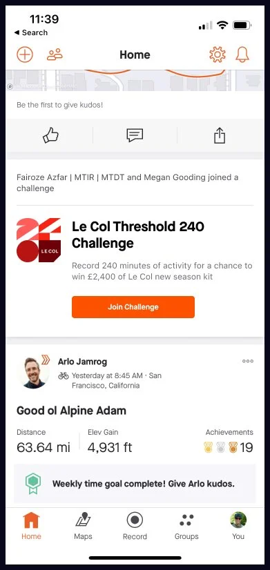
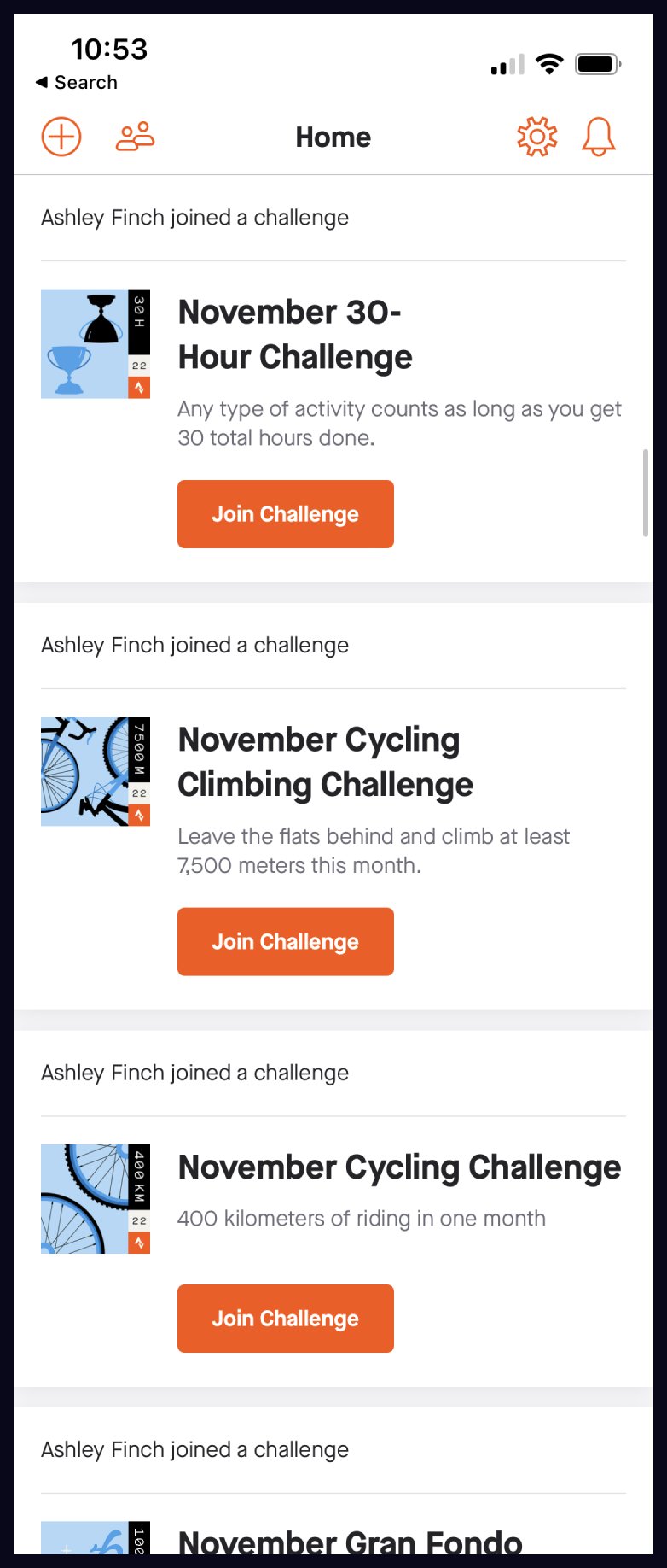
One commonly-reported issue among Challenge participants was the fact that Challenge joins were not concatenated in the Home feed. Strava’s Challenges are released monthly about a week before the beginning of a new month, so it’s not uncommon for there to be a flurry of challenge join activity in a short span of time. However, each Challenge join yields a unique feed entry. We wanted to explore ways to concatenate joins that motivated the user to partake in something that interested their Strava friends.
The dreaded “join spam”.
Carousel by Challenge
Leverages current treatment & content
Carousel by Challenge
with facepile
✅ My Recomendation For MVP
This is my recommended route because the facepile treatment scales well when many friends join.
Carousel by Athlete
❌ Will Not Do Right Now
Our data model does not support joining challenges rooted from another athlete’s join list.
Nudge users to join challenges they’ve nearly completed
One “leaky” in our product strategy was that a user could nearly complete a challenge, or even complete a challenge outright, but they would not get credit for engaging in that challenge until they elected through the Challenge gallery to join that challenge. I was tasked to explore some ways we might display to users that they could receive credit for achieving the terms of a Challenge, and could claim their digital (and sometimes real-world) reward by joining the Challenge.
Below are some explorations of that “Nearly there!” module, as well as how that module could display in situ. I tried to lean into the encouraging aspects of the sunk-cost fallacy, encouraging a user to make a return on the work they had already done.
Book time with me to chat more about this or any of my case studies!


